

LAVENTA
Overview:
Laventa is a modern e-commerce mobile application designed for users who enjoy discovering and purchasing stylish accessories effortlessly. The goal was to create a seamless shopping experience that balances aesthetics with usability, ensuring users can browse, explore, and purchase with minimal friction.
Problem:
Most e-commerce apps overwhelm users with cluttered interfaces, excessive choices, and complicated checkout flows. This leads to:
-
Decision fatigue during product discovery
-
Drop-offs during checkout
-
Lack of emotional engagement with products
-
Poor navigation between categories and collections
Users want fast, visually appealing, and intuitive shopping experiences, especially on mobile.
Competitor Analysis:
I analyzed leading e-commerce platforms (fashion + accessories focused) to understand common UX patterns.
Competitors reviewed:
-
Zara
-
Myntra
-
Swarovski
-
Amazon
Key Insights:
-
Clean product grids improve browsing efficiency
-
Strong visual hierarchy helps users scan quickly
-
Fewer steps in checkout = higher conversions
-
Wishlist & save features increase return visits
-
Personalization boosts engagement

User Behavior Insights:
-
Users browse more than they search
-
Visual appeal heavily influences buying decisions
-
Impulse purchases are driven by recommendations
-
Trust signals (reviews, ratings) impact conversions
Design Goals:
Based on research insights, the following design goals were defined:
-
Simplify product discovery
-
Create a visually engaging interface
-
Reduce friction in checkout
-
Encourage exploration and repeat usage
-
Maintain a premium yet accessible feel
Information Architecture:
The app is structured around a shopping-first experience:
-
Home
-
Categories
-
Product Listing
-
Product Details
-
Wishlist
-
Cart
-
Checkout
-
Profile
Focus: minimum steps from discovery → purchase
User Flow:
Optimizations:
-
Quick add-to-cart from listings
-
Persistent cart visibility
-
Minimal form inputs during checkout
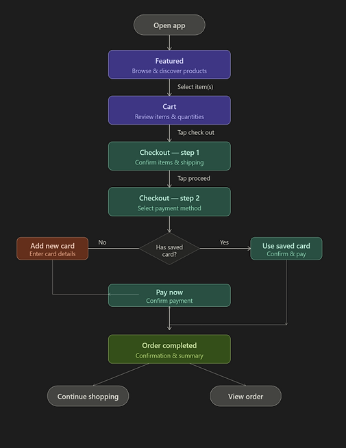
Wireframes

The wireframes focus on reducing friction across the checkout journey while maintaining clarity and control for the user.
Flow Enhancements:
-
Linear but flexible flow → users can go back anytime
-
Minimal steps (2-step checkout) → reduces drop-offs
-
Inline actions (edit, add card) → avoids breaking flow
-
Clear CTAs at every stage → no confusion
UI Screens

Challenges:
-
Balancing Visual Appeal vs. Usability
-
Creating a stylish UI without compromising clarity
-
-
Reducing Checkout Friction
-
Ensuring fast completion without overwhelming forms
-
-
Product Discovery
-
Helping users find products without relying heavily on search
-
Solutions:
-
Used strong visual hierarchy to guide attention
-
Designed quick actions (add to cart, wishlist)
-
Simplified checkout into minimal steps
- Introduced curated sections (trending, featured)
- Maintained consistent spacing and layout for clarity
Outcome:
-
Improved browsing experience
-
Faster purchase flow
-
Reduced cognitive load
- Increased engagement through visuals
What I Learned:
-
Visual design directly impacts conversion in e-commerce
-
Simplicity is key to mobile shopping experiences
-
Micro-interactions and layout consistency build trust
- Discovery is just as important as search