
Redesigning Spotify
This is my attempt at redesigning Spotify's User Interface using Figma, aiming to improve the accessibility, usability and aesthetic coherence.

I undertook a redesign of Spotify for this project, implementing changes aimed at enhancing the User Interface's visual appeal and accessibility. Additionally, I conducted a survey to gather consumer insights and incorporate their preferences into the application.
Outcomes:
-
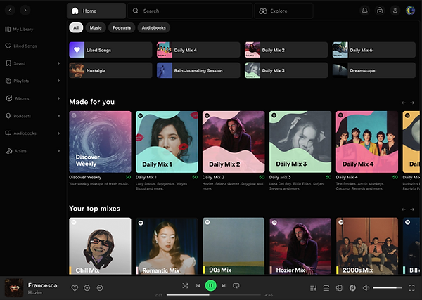
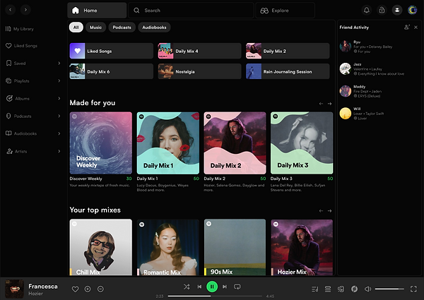
Easier navigation between pages.
-
An expandable side menu.
-
A like button (I'm still surprised Spotify hasn't added it yet).
-
Arrows for viewing the rest of the playlists instead of the "Show All" option.
Outcomes:
-
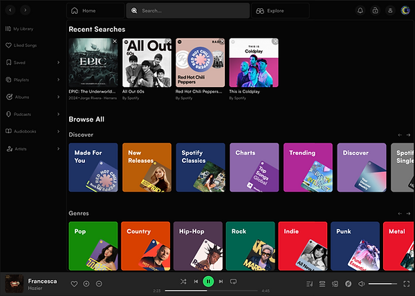
A visually pleasing and sorted search page, unlike the one Spotify currently has.
-
Sorted by genres, mood & activity, entertainment, podcasts, audiobooks and more
Outcomes:
-
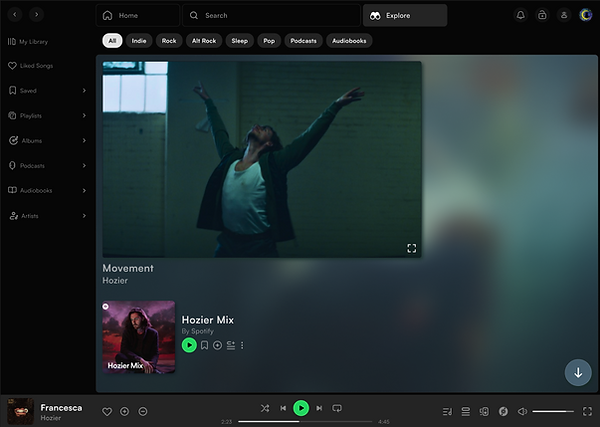
An Explore page, that's not yet available on the Spotify desktop application but on the mobile application on the home page when you scroll down, I made changes to that and added a separate explore page which allows you to save playlists and songs for later.
-
Allows you to scroll down, and explore more.
Outcomes:
-
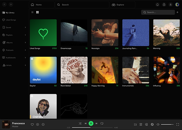
A Library that opens as a separate page, rather than just expanding.
Outcomes:
-
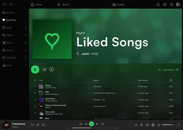
Updated the interface of the liked songs page as well as the cover picture for it.
Outcomes:
-
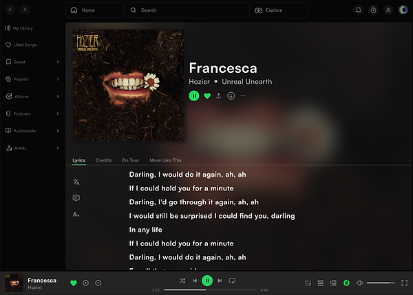
An updated 'Now Playing' screen with options to translate the lyrics, add notes for later view, and change font size.
Outcomes:
-
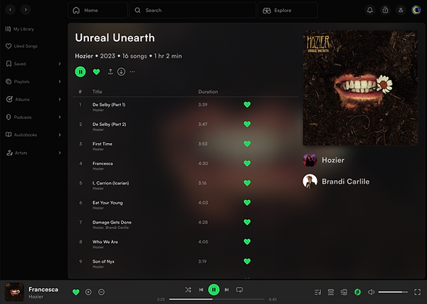
Updated the interface of the albums page.
Outcomes:
-
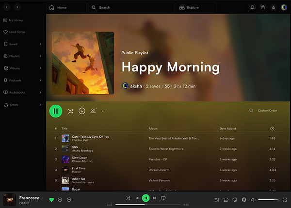
An updated 'Playlists' screen.
Outcomes:
-
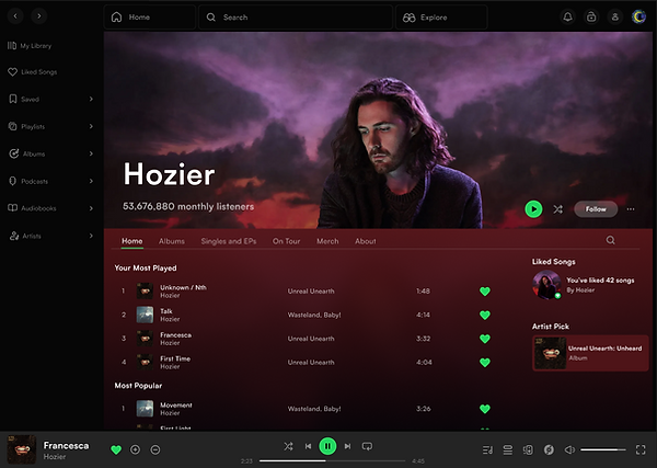
Updated and sorted the interface of the Artist's home page.
-
Added a few tabs about the information one might need from the page.
Outcomes:
-
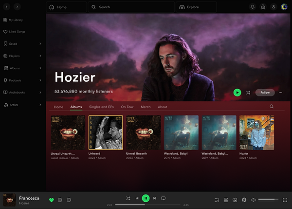
Added a separate Albums only page by an artist.